


Responsive Website Design
Responsive design refers to making sure your website looks great on any device. It ensures optimal usability and performance on desktops, tablets and mobile devices. A responsive website is also a must for search engine optimization as Google indexes content from mobile first.
If your site isn’t designed with all screen sizes in mind, you could be losing customers.
Why is Responsive Design Important?
Responsive design is important because it allows websites to be viewed optimally across all devices. It ensures that content shows up properly on any device, regardless of screen size or orientation. Responsive design also makes sites easier to navigate, as the same navigation menu and structure will remain consistent across all devices. By using responsive design, users can have a better experience when visiting a website, and site owners can rest assured that their content is accessible to everyone. With today’s increasing use of mobile devices, responsive design has become vital for the success of any website.
The Risk of Not Having a Responsive Site
Without a responsive website, visitors may be met with a frustrating user experience. Content might not show up properly on the device, or they might have difficulties navigating around the site due to poor design. Additionally, search engines will penalize websites that are not optimized for mobile devices, hurting its SEO rankings and leading to fewer visitors.
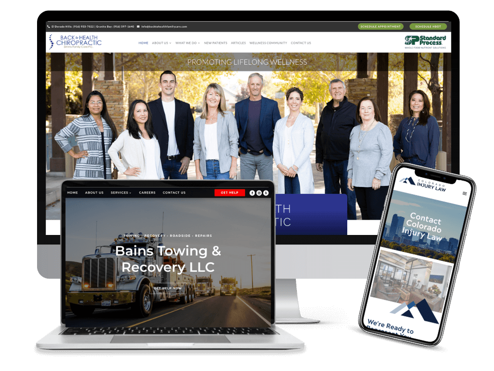
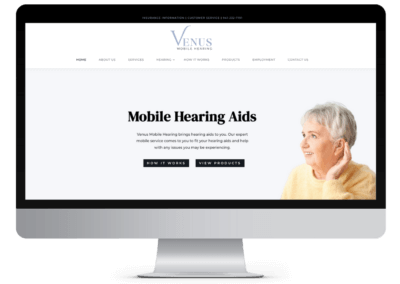
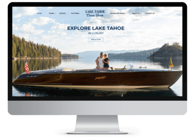
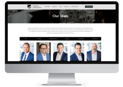
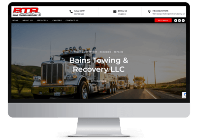
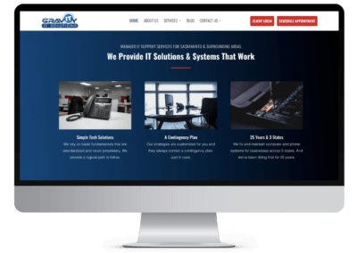
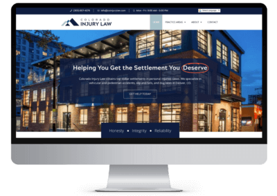
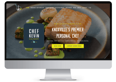
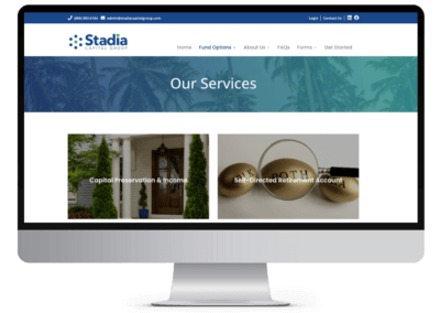
Example Responsive Design Projects


Responsive Web Design & SEO
Improve Content Accessibility
Responsive web design is preferred by search engines and there is a direct correlation in rankings / organic traffic. Websites that focus on a design that works on all devices are guaranteed to perform better in search results. A mobile-first design puts content first so search engines can easily find the information they’re looking for without any problems. By making sure your site is coded for different types of devices and is built in a responsive manner, you’ll make sure that users have a great experience regardless of what type of device they’re on.
With content that is more accessible to users and search engines on different devices, you increase your chances of ranking higher.
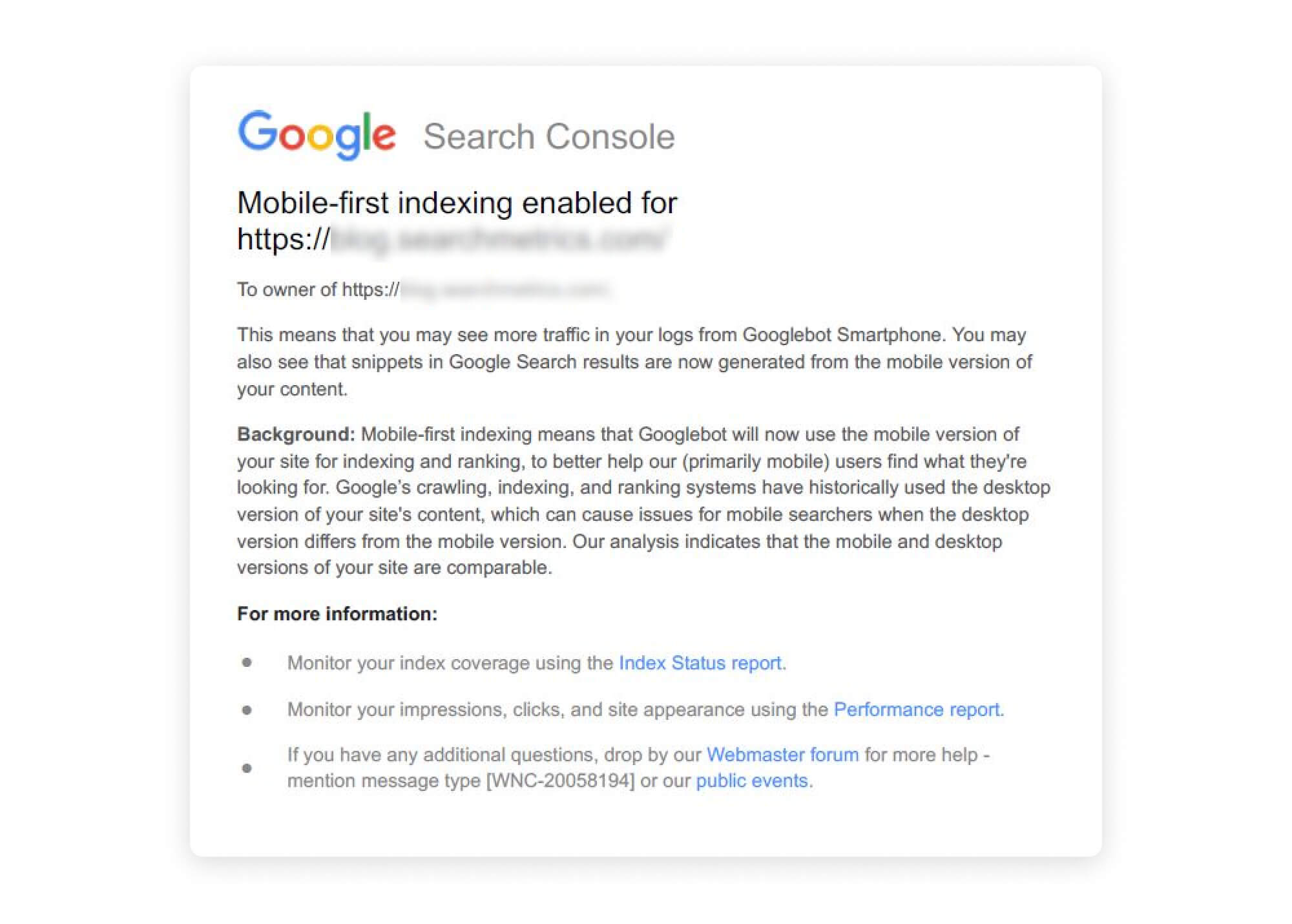
Mobile-First Indexing
Google has also switched to mobile-first indexing meaning that mobile content and performance are now given priority in their rankings. As such, it’s important to ensure that your site is optimized to be properly indexed by Google on both desktop and mobile devices. This means having a strong SEO strategy in place for both versions of your website.
It’s also important to consider the experience of mobile users. You may want to move a contact form higher up on a page, change a button on a product page or make a process on the site easier to handle from a mobile device. This type of mobile-first thinking is exactly what Google wants to see and helps to improve your rankings.
Frequently Asked Questions About Responsive Web Design
Why is responsive design important?
How does responsive design work?
Are there any drawbacks to responsive design?
Do I need to redesign my current website to make it responsive?
How do I test if my site is responsive?
Can my content be different on different devices?
While it is possible to have slightly different content on different versions of your website, it is generally recommended to maintain consistent content across all devices. This ensures a cohesive user experience and avoids confusion for users who switch between devices. It’s also recommended for SEO.
What is the difference between responsive and mobile-first?
Does responsive design improve conversion rates?
Web Development Tips and Advice
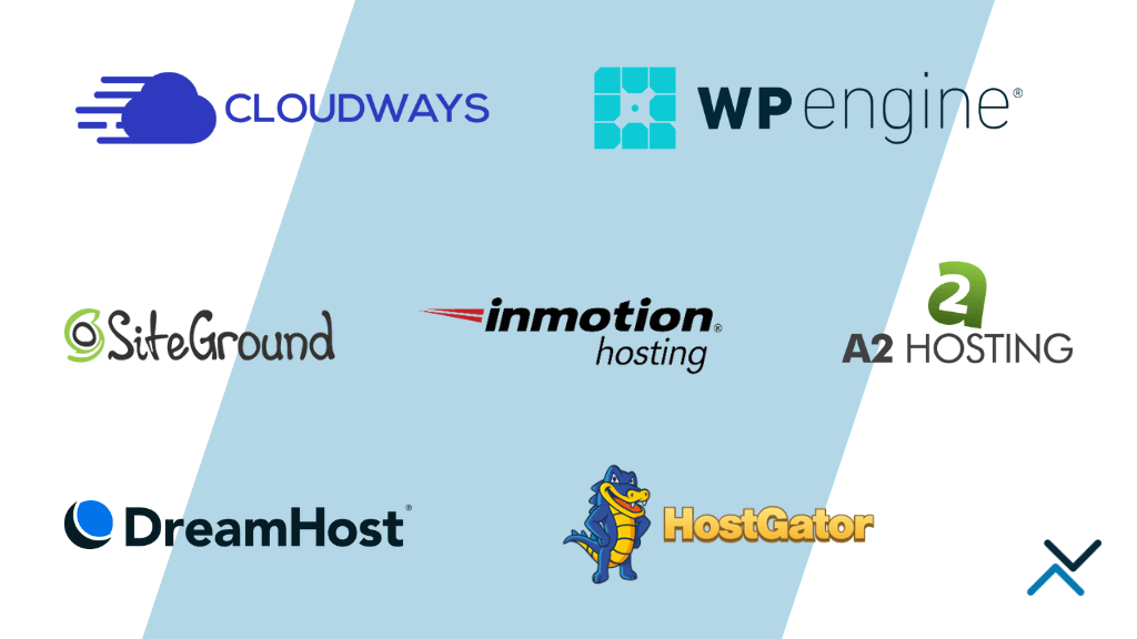
Our Take On Web Hosting Platforms in 2024
Finding the right web hosting solution can be a time-consuming process that depends on a variety of factors, such as the type of hosting required, particular features desired, and budget...

How to Edit DNS Records for Google Workspace
The Domain Name System, or DNS, serves as the internet's directory, determining where web traffic should be directed. For businesses using Google Workspace, understanding and managing these records...
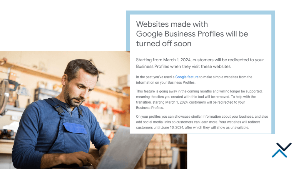
Goodbye to Google Business Profile Websites
We've all said it plenty of times - don't build your site on a platform where you can't own its content or user experience. If you're investing in building a brand through a website, you don't want...
5 Reasons to Keep WordPress Sites Updated
If you've dabbled in website maintenance or blogging with WordPress, you've no doubt heard the oft-repeated mantra: "keep your site updated." At first sight, this advice may appear to be a simple...

Web Security Best Practices: Protecting Sites from Vulnerabilities
Online security is no longer an area to take lightly. With cyberattacks and data breaches, companies must protect their websites from vulnerabilities. But how can we make sure our sites are...

6 Ways to Keep Your WordPress Website Fresh
In today's fast-paced digital realm, having a captivating website is an absolute must for any business or individual seeking to make their mark online. And when it comes to crafting a stunning...
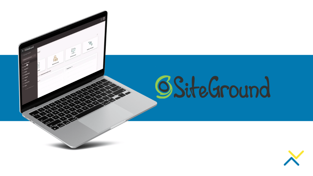
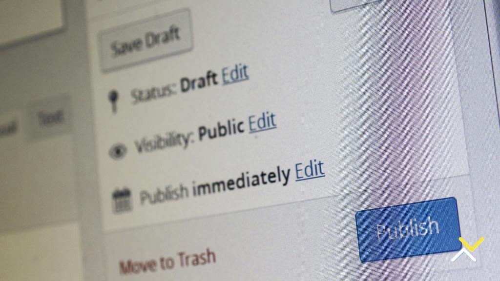
How to Provide Collaborator Access in Siteground
SiteGround, a leading web hosting platform, provides a user-friendly interface and powerful features that enhance collaboration between clients and web developers. One of its key features is...
7 Common WordPress Website Design Mistakes
WordPress has emerged as an immensely popular website creation platform, boasting a staggering number of over 60 million websites built using its versatile features. This remarkable success can be...

The Importance of Hosting to Google Rankings
A company's success or failure in today's digital economy may hinge on its online presence and search engine rankings, making it crucial to comprehend the factors that influence these metrics....

How WordPress Adapts to Your Business Needs
Establishing a formidable online presence is imperative for businesses, regardless of their size. A captivating and seamless website holds incredible potential to entice and captivate customers,...
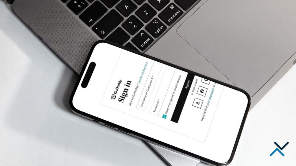
How to Provide Delegate Access in GoDaddy
As a business owner or website developer, you may find yourself in a situation where you need to grant someone else access to your GoDaddy account without revealing sensitive information, such as...

How WordPress & WooCommerce Simplify Online Selling
Online selling has become an essential aspect of the commercial landscape. Entrepreneurs and businesses of all kinds are flocking to e-commerce platforms to reach a worldwide client base and...
The Octiv Note
Stay up-to-date with the latest news and tips from the world of digital marketing, web development, and SEO!
GET HELP
Connect with Us
